"Traipse" as used in the Argos TV ad.
Definition: To tramp or trudge wearily / A tedious journey on foot *
Most consumer groups advise you to shop around to find a good deal. Some people (not me) actually enjoy the experience of 'going shopping'.
Contrariwise, the Argos message (as with any department store / big catalogue) is that you don't have to, because you can find everything you need in one place.
So they take the positive 'shop around' and turn it into the negative 'traipse around'.
Your challenge this week is to use the word "traipse" as often as possible. And if you don't want to do that, then try using the word "contrariwise."
* Source: The Concise Oxford Dictionary
Sunday, 28 September 2008
Friday, 26 September 2008
Did I really hear that?
Driving to Clapham yesterday, I heard a Visa ad on the radio that included the line: "Take her up the allotment".
Bet the copywriter had a laugh when the client approved that script!
(I was going to say 'when that one slipped through' but I thought it might be a bit rude.)
Bet the copywriter had a laugh when the client approved that script!
(I was going to say 'when that one slipped through' but I thought it might be a bit rude.)
Thursday, 25 September 2008
And now
we're watching screens on our screens (see previous post)!
Ford Fiesta
The car is supposed to be targeting women.
I'm a woman!*
But I didn't even notice the car was pink.
Maybe it's because the ad, to me, appears to be targeting men.
You know, screens, technology, all that gadgety kind of thing that us girlies can't get our pretty little heads around. All shot in in scary streets in the dark of night.
Maybe they should have showed how many kids / shopping bags / bars of chocolate could fit inside the car = giant handbag on wheels.
After all, isn't that what women's cars are for?
* Not a typical woman, I admit.
Wednesday, 17 September 2008
Move it!
I went up to London recently. Travelled on the tube. Couldn't help noticing that some of the promotional posters that used to line the escalators have been replaced by screens showing moving adverts.
I know why they've done it.
It's because the eye can't help but be drawn to something that moves. It's why you can't stop flicking your gaze towards the TV when it's on in a room, even if you're not 'watching' it. And why web designers include Flash animations on otherwise static web pages.
But it worries me.
So many of us work at a computer all day, looking at light on a screen. Then we watch TV or go to the cinema for relaxation, looking at a screen. Or we play computer games, go on social networking sites, or check our emails on the move. Looking at a screen.
It can't be good for the eyes.
Why am I writing this? Why are you reading it?
Saturday, 13 September 2008
Wednesday, 10 September 2008
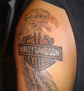
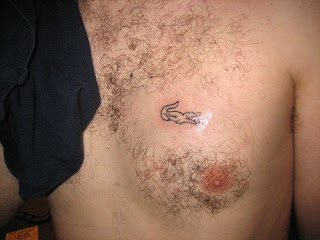
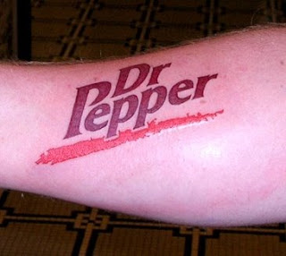
The sign of a really really really well-loved brand...
...is when customers get it tattooed on their skin!
I can understand why it works for Harley Davidson.
I get that it could be slighty ironic for Lacoste.
But I'm bewildered why anyone would want a tattoo of Dr Pepper!
P.S. The Apple tattoo collection. Ouch.
I can understand why it works for Harley Davidson.

I get that it could be slighty ironic for Lacoste.

But I'm bewildered why anyone would want a tattoo of Dr Pepper!

P.S. The Apple tattoo collection. Ouch.
Tuesday, 9 September 2008
I'm sitting on the train to Kent...
...looking at an advert.
Is the main logo at the top? No, it is not. It's in the bottom right hand corner, so it's the last thing you see. (No-one cares who you are until they know what you can do for them.)
So what's at the top?
A dramatic picture, about half the page, of a big-wheeled red truck driving over some squashed cars.
Then there's a heading: 'The Hop Farm, Paddock Wood' and sub-heading: 'Experience some of the South East's best events by train' (which tells me Who What When Where Why and How).
Some brief body copy follows but I can't read it from this distance.
And the call to action (phone number and web link) is big at the bottom.
Why is it laid out this way?
Because those of us who read from left to right read print ads with a Z-pattern eyeflow, starting at the top left, crossing to the top right, moving diagonally down to bottom left and leaving the page at bottom right.
So that's the best way to lay out your ads too.
Thursday, 4 September 2008
Back to Basics

Coca Cola packaging got a bit cluttered. So they've simplified it. And isn't it lovely!
Read more about the Coke redesign
Monday, 1 September 2008
Comparing the comparison sites
I like to think my buying choices are not affected by adverts. But of course they are. For instance, for the past few years I've been buying my car insurance via confused.com. When I first saw their TV ads I thought "Brilliant! They've solved the problem of spending hours on the phone or Internet repeating your details every time!"
Last week I travelled on the tube to meet a friend in London.
In front of me was an ad by moneysupermarket.com. I've also seen their ads on TV, but buyer apathy meant I stuck with confused.com as my comparison site of choice.
Not any more.
The Money Supermarket ad displayed the results of independent research by Ipsos MORI of the number of cheapest quotes out of 100 for car insurance.
As I writer, I always carry pen and paper with me in case inspiration strikes. In this case, I noted down the numbers for you:
Money Supermarket 42
Tesco Compare 22
Confused 19
Go Compare 17
Compare The Market 13
USwitch 9
OK, so they don't add up to 100. I'm guessing some of the sites offered the same cheap quotes. And I don't know what spec of car they quoted for. I'm guessing it's one that shows their results more favourably.
Because we're all busy people, we take short-cuts when we can to save time. For me, next time I need car insurance, I'll go to Money Supermarket. I'll wait until then to see if I like their site as much as I like(d) Confused.
Because sometimes numbers speak louder than words.
Subscribe to:
Comments (Atom)